
Check layout changes before publishing
Responsive HTML Preview on Mac
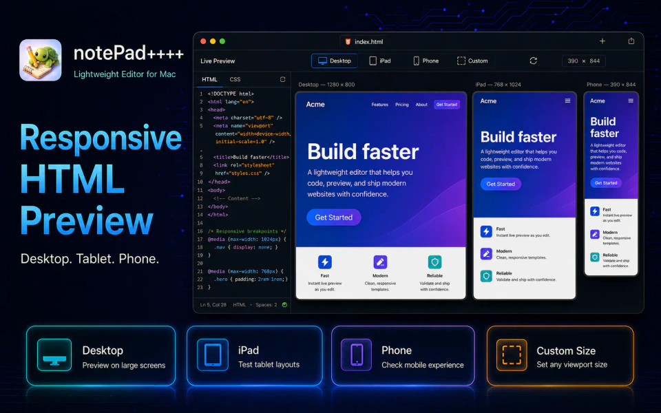
A page that looks correct in a wide preview can still overflow, hide controls, or become hard to read on a tablet or phone. notePad++++ lets you switch the same local HTML preview between responsive, desktop, iPad, phone, and custom viewport sizes.
Test the layout at useful viewport sizes
Responsive design depends on the available viewport width and height. Checking only a full-width desktop pane can miss problems in navigation, grids, buttons, images, tables, and long text.
notePad++++ includes desktop presets, several iPad sizes, common phone sizes, and custom width and height fields. The preview scales to fit the available Mac window while preserving the selected viewport dimensions.
- Use a flexible preview that follows the current pane.
- Check desktop sizes such as 1440 × 900 and 1920 × 1080.
- Check iPad Pro, standard iPad, and iPad mini viewports.
- Check compact, standard, large, and Android-style phone widths.
- Enter a custom width and height from 240 to 5120 pixels.
- Swap width and height to check portrait and landscape layouts.
Responsive and desktop preview modes are available without Pro. The named iPad and phone preview modes are Pro features.
Watch: desktop, phone, tablet and rotation
Watch the same local HTML file switch from desktop to portrait phone, landscape phone and an iPad Pro 11-inch viewport in 45 seconds. Close-ups show the device selector and rotation button while the source stays beside the preview. These are viewport previews, not tests on physical devices.
Download notePad++++ on the Mac App Store to try it with your own local HTML files.
Look for layout failures, not just smaller screenshots
A device-sized preview is most useful when it leads to specific checks. Look for horizontal scrolling, clipped text, controls that wrap unexpectedly, images that escape their container, fixed elements covering content, and tap targets that become too crowded.
Because the source stays beside the preview, you can change a media query, class, viewport setting, or element structure and immediately check the same problem again at the selected size.
Check portrait, landscape, and exact breakpoints
Phone and tablet layouts often behave differently after rotation. A page that works in portrait can expose a short-height problem in landscape, especially with fixed headers, dialogs, menus, or vertically centered content.
Custom dimensions are also useful when a user reports a problem at a specific browser size or when a design changes at an exact CSS breakpoint. Enter the width and height directly instead of repeatedly resizing the whole Mac window by hand.
Combine viewport testing with HTML inspection
A missing viewport meta tag can make a mobile layout behave differently from what the CSS suggests. The HTML issue inspection reports this and other common document problems, while local resource inspection catches missing CSS, scripts, and images.
If a responsive interaction throws an error or a resource fails to load, the preview error panel keeps the problem close to the page. The source-location tool can then take you from a visible element back to its HTML instead of forcing a manual search through the file.
A practical responsive HTML check
| Preview | What to inspect |
|---|---|
| Responsive pane | General behavior while resizing the editor window |
| Desktop | Maximum content width, wide grids, navigation spacing, and fixed sidebars |
| iPad portrait and landscape | Grid changes, navigation wrapping, tables, and image proportions |
| Phone portrait | Horizontal overflow, readable type, stacked controls, and content order |
| Phone landscape | Short viewport height, fixed headers, dialogs, and menus |
| Custom size | A reported device, embedded web view, or exact CSS breakpoint |
FAQ
Can notePad++++ preview HTML at phone and iPad sizes?
Yes. The HTML preview includes phone and iPad presets in addition to responsive, desktop, and custom viewport modes. The named phone and iPad modes are Pro features.
Can I enter a custom viewport size?
Yes. Width and height can be entered directly, and the preview scales down to fit the available Mac window when necessary.
Can I switch between portrait and landscape?
Yes. The rotate action swaps the selected width and height.
Does a viewport preview replace testing on a real device?
No. It is a fast way to catch layout problems while editing. Final checks on real devices are still useful for touch behavior, browser differences, performance, and platform-specific behavior.
Notepad++ is a trademark of its respective owner. notePad++++ is an independent macOS text editor and is not affiliated with, endorsed by, or approved by the official Notepad++ project.